Cash with Friends
Projects | | Links:

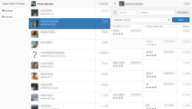
Sending, receiving and keeping track of IOUs between Facebook friends with a UI that is reminiscent of messaging apps like WhatsApp.
If the best way to build a business is to “make something people want”, this was the exact opposite. Keeping track of every last cent simply wasn’t something people wanted, at least not those with either cash or friends.
On the upside, making the app feel like WhatsApp was a good design decision and at the time similar apps generally felt worse. In retrospect, doubling down on the chat metaphor would have been an interesting route to explore.
Design
I kept the design intentionally minimalistic, but pairing the already dull subject of money with the excitement of excel spreadsheets was the wrong time to atone for the design sins of the past.
The spartan aesthetics didn’t prevent me from making bad UI decisions, such as the icons which were confusing to everybody except myself, or the input form which routinely led people to do the exact opposite of what they wanted to do, including myself.
Tech
The UI was a fairly complex React app using the then popular Flux architecture. The frontend is fully responsive, has nice page transitions, working links and browser navigation and just felt snappy overall.
