Responsive Web Apps with vw and vh
When it coms to response web design media queries with fixed breakpoints are quite nice to adjust sites to different screen sizes. But what about font sizes?
When it coms to response web design media queries with fixed breakpoints are quite nice to adjust sites to different screen sizes.
But what about font sizes?
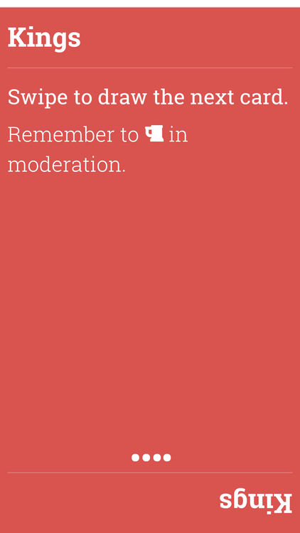
Many times they will change from one fixed size to another at a certain trigger point, as does this web site. This makes sense of apps that change their layout at that point anyway. However I’d call that unnecessary micromanagement. Especially for apps that have a strong focus on fonts, as it has been the case with my most recent UI for Kings (You can download it from Google Play).
Enter vw and vh! These two CSS size units are 1/100th of the viewport width and height respectively. All measures in this app are specified in either vw or vh. Here is a taste:
.app h1 {
  font-size: 9vw;
  line-height: 10vw;
  margin: 5vw 0;
}
In fact it follows very strict rules that tend to work really well for this kind of (typography-heavy) UI:
As long as the width is greater than the height use vw. As soon as the height becomes greater than the the width use vh.
This is done via a media query:
@media screen and (min-aspect-ratio: 1/1) {
  .app h1 {
    font-size: 9vh;
    line-height: 10vh;
    margin: 5vh 0;
  }
}
Note that there is no visual break point as vw and vh are the same size when this media query “triggers”.
Unfortunately vw and vh are not supported by every browser. However there is a neat code snippet by Roman Rudenko that simulates vw with rem and some JavaScript. rem uses the root element’s font size as a reference. So 1rem is equal to the font size of the root element, 2rem double that and so on.
However I needed to adjust the snipped a bit to take into account vh as well:
(function (doc, win) {
    var docEl = doc.documentElement;
    var recalc = function () {

      var mq = win.matchMedia("(min-aspect-ratio: 1/1)");
      var reference;

      if (!mq.matches) {
        reference = docEl.clientWidth;
      } else {
        reference = docEl.clientHeight;
      }

      docEl.style.fontSize = (reference/100) + 'px';
      docEl.style.display = "none";
      docEl.clientWidth; // Force relayout - important to new Androids
      docEl.style.display = "";
    };

    if (!win.matchMedia) return;
    if (!doc.addEventListener) return;

    var hasSupportFor = function (unit) {
      var div = doc.createElement('div');
      div.setAttribute('style', 'font-size: 1' + unit);

      return (div.style.fontSize == '1' + unit);
    };

    if (hasSupportFor("vw") && hasSupportFor("vh")) return;
    if (!hasSupportFor("rem")) return;

    win.addEventListener('resize', recalc, false);
    recalc(); // make sure the DOM is loaded at this point.
})(document, window);
What this does is to make sure the font size of the root element is always set to 1/100th of either the view port width or height. This depends on the result of the media query.
In order for this to work we need to change our initial css to:
.app h1 {
  font-size: 27px;
  font-size: 9rem;
  font-size: 9vw;

  line-height: 30px;
  line-height: 10rem;
  line-height: 10vw;

  margin: 15px 0;
  margin: 5rem 0;
  margin: 5vw 0;
}
This uses a simple fall back trick. Browsers that support vw/vh will simply override the previous statements. Browsers that don’t support vw/vh will ignore these statements.
For Browsers that support neither vw/vh nor rem I provide a rough pixel value. It turned out that a factor of 3 is ok for mobile phones but is to small for tablets. However it’s still readable and doesn’t break the layout.